Category Archives: Uncategorized

Bonus Lesson 3


Email1K


Lesson 13: Using Webinars to Sell to Your List
Written by Brennan Dunn at DoubleYourFreelancing.com

Since May, I’ve sold $176,612 of my course, Double Your Freelancing Rate.

And $86,461 of that came from pitching it to strangers over webinars.

Had you asked me earlier this year if I would ever sell anything over a webinar, I would have said you were crazy. After all, webinars are for scammy Internet marketers. No one actually buys anything, especially legitimate products, from webinars… right?

Rethinking The Webinar

Imagine an information dense blog post that you couldn’t skim through, and at the end of the post the author was waiting — live! — for any questions you had for him or her.

That’s what a training webinar is, and when done right can yield thousands of new opt-ins and dollars for you.

The best webinars should be valuable in their own right. Even if an attendee doesn’t buy from you, they should still walk away with a ton of value from watching. Your goal is to impress someone with your authority and expertise, and then allow them to take that next step and buy your product.

Step #1: Promoting Your Webinar

When announcing the webinar, you need to do a bit more than just driving clicks to a registration page.

Take a second to read this email.

The structure is one that I’ve used with just about every webinar promotion email I’ve written. I won’t dwell too much on the copy itself, but I do want you to notice a few things about how I’ve laid out the email.

  1. I start by clearly stating I’m promoting something (a free webinar) and that at the end of the email I’ll be giving out the details. When faced with an unknown wall of text, people are liable to skim. I’ve found that when I make it clear that this email is about a free webinar that I’m inviting the reader to, the engagement on those emails lift substantially.
  2. I qualify the reader by letting them know I understand who they are and what they’re struggling with. If they’re nodding their head in agreement by the time I get to the event details, then this person is probably going to show up to the webinar.
  3. I show the reader what life would be like if these pains go away.
  4. I then invite my reader to attend a training webinar that will cover how to remove these pains AND I tell them that I want to make it personal to them and their business by offering live Q&A, which is something most mediums (blog posts, podcast episodes, ebooks, …) by definition can’t support.

The registration page they’re driven to is a relatively simple template that includes a headline, byline, registration form, and a quick overview of what we’ll be covering. I’ve promoted this template both to my list (without the branding and co-host) and to joint venture audiences. (Checkout Joseph Michael’s lesson for more information on getting setup with joint ventures.)

The average conversion rate I get on this template is about 85%.

Step #2: Getting People To Show Up

Typing your email into a box and clicking a button is much easier than carving an hour out of your schedule to listen to some dude or dudette talk for an hour.

Most live webinars have a pretty low show-up rate — the average is somewhere between 10-20%. And while the majority of your sales will likely happen after the event (as we’ll cover in a second), people who attend your event live are significantly more likely to actually buy.

What you don’t want to do is to process someone’s registration and then notify them an hour or so before hand. Yeah, you’re excited about the event and you’ve been counting down the days until you go live — but no one else is.

I’ve experimented with a lot of ways to encourage people to show up, and here is the one that worked best:

In your “thanks for registering” email, include a survey

Once somebody opts in to your webinar, you want to send them an email that lists the date/time of your webinar (if you’re audience is mainly US based, show the times in Pacific/Eastern/GMT).

One addition that works great is to link to a survey that not only helps you identify who will be in attendance and what they’re looking for, but — more importantly — allows them to have some “buy in” in the success of the webinar. I’ve found that people who take my pre-event surveys are more than 3x likely to attend live.

Ask people to share your webinar immediately

People are wired to want to tell others about awesome stuff they come across. Get people excited about your event, and then ask them to share it with their friends.

I’m attending a #freelance pricing workshop on Tuesday, September 9: http://doubleyourfreelancing.com/w/design-hackers/ @kadavy @brennandunn

You’re going to want to include a click-to-tweet link both in your confirmation email AND on your confirmation page.

Build excitement the Sunday before your event

Most of my webinars are on Tuesday or Wednesday, and the Sunday before I always send out an email that recaps some of the best survey feedback I got. Why Sunday? I’ve found that weekends aren’t the best for emails that include a strong call to action (e.g. a “buy now” link). But they work great for conditioning and getting people excited.

You’ll also be able to include another link to the survey (for those who didn’t fill it out when opting in) and the tweet you want people to share.

Send out two emails the day of your event: one in the morning and one 30 mins beforehand

Most of my webinars are at 2pm Eastern time, so I’ll send out a reminder at 7am (“Reminder: Your workshop is later today”) and at 1:30pm (“The workshop is about to begin”).

These emails are relatively short. The morning email lists the time again, and is also when I first include the link to the webinar room. The email I send right before the event pretty much just includes a link to the event.

Step #3: How To Host Your Event And Handle Registrations

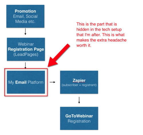
The way I setup my webinars is pretty simple, though it will require some technical chops to set it all up (alternatively, you could use a tool like GotoWebinar, but I’m not too fond of their registration system and that attendees are required to download their software.)

Ultimately, you need 3 pages for your event: the registration page (opt-in), the confirmation page, and the page you drive attendees to in order to watch your event.

The Registration Page

Your registration page is a basic page that has a strong headline, a brief explanation of who you’re targeting and what attendees will get from the event, the date and time, a signup form, and a bit about what you’ll cover and who’s hosting. The only goal of this page is to get people to register. Minimize any distractions (like navigation elements) or reasons that people could bail. My registration page converts at around 85%, regardless of traffic source.

The Confirmation Page

The confirmation page, which is the redirect URL for the opt-in form you embed on the registration form, is a simple page that has two goals:

  1. Get people to share the event on Twitter and Facebook (Noah did this brilliantly with the email1k confirmation page)
  2. Get people to add the event to their calendar.

Include a one-click add to calendar and one-click tweet / share on Facebook buttons.

The Event Page

This is a basic page that has two iframe embeds on it — Google Hangouts on Air and Chatroll (more on both in a second). That’s it.

Just about any web developer should be able to get all this setup in a few hours, but I am working on abstracting into a free plugin a lot of the custom work I’ve done to make getting this setup turnkey in my WordPress installation. If you’re interested in this, click here and I’ll send it to you when it’s ready.

Why Hangouts On Air?

You’re probably familiar with Google Hangouts, but did you know Google provides a way for you to quickly and easily stream to an unlimited number of people — and for free?

Here’s what I like about Hangouts On Air:

  • Can be embedded easily onto any web page.
  • Automatically records all of your events. In fact, anyone who views your event page
  • AFTER a hangout has started will see the replay. No need to create a separate replay page!
  • Shows a cool little countdown timer before the event starts.
  • Free 🙂

The only downside I’ve found is that there’s often a 20ish second delay, which makes live Q&A sometimes painful. This is why I ask people to voice their questions during my presentation instead of when I move into doing Q&A.

Why Chatroll?

Chatroll is an embeddable chatroom. It’s free for up to 10 connected attendees, and is $19 a month for up to 100 attendees (probably more than enough for most people). I place this directly under the video feed from Hangouts.

Here’s what I like about Chatroll:

  • I’ve tried other services, and most of them crap out after a few dozen attendees. I’ve had close to 1000 people watch and chat live and everything… worked.
  • Overflow attendees (e.g. your 101st attendee if you have the $19/mo plan) can still see the chat and can join in if someone drops out. This is a great way to get people who have a coveted chat slot to stay.
  • Archives chat history automatically and shows you stats about how many attended, etc.

I wish there was a way for the host of the event to see

Step #4: Structuring The Webinar

Here’s how I structure my webinars:

Get the room excited

The first thing I do is I ask people where they’re from and what they do. I usually start doing this well in advance of the start time of the event — usually around 10-15 minutes early. Most of my webinars are on pricing, so I’ll usually ask attendees what sort of work they do, the URL of their portfolio, and what they typically charge. People love sharing about themselves and their business.

Establish credibility and motivation

You need to let people know why they’re here and why you’re the best person to present to them. Remember that they’re taking time out of their schedule to sit and watch you live — don’t take that for granted.

I start each presentation with a bullet list of what I’ll be covering. I want to remind people of what they’re getting into. The last thing an attendee wants is to think that they’re in some sort of open-ended presentation. Tell people what you’ll be covering, and tell them immediately. (I typically let people know the training part of the webinar takes about 30 minutes, and then I’ll be around for up to 30 minutes for Q&A.)

Afterward the intro, you’re going to want to introduce yourself, but do it in a way that relates to your product. I talk about my struggles with pricing, and how when I first started out I undercharged and worked with some pretty crappy clients. This ultimately relates to both my presentation and the product I’m promoting, but also establishes my experience and expertise.

Teach something

You need to give something away for free. People need to walk away from your webinar having learned something of value. I’ve seen first hand webinars and seminars that are 100% focused on the product — and the host is left scratching their head afterward, wondering why nobody bought.

I dive into the first section of my course. It’s all about the mindset changes that need to happen before you can sell to clients at a higher rate. For me, this makes a lot of sense because I can later present the product as the implementation of what I’m covering. I’m outlining the why, and selling the how.

The training section of my presentation is about 30 minutes. Rather than describe in detail what I present, here’s a link to a recording of one of my webinars. But my goal is to legitimately provide value. I want people to recognize that I’m capable of providing them value, and at the end of my presentation I show them how through paying me they can receive exponentially more value from me.

Backroads or the expressway?

I made the mistake early on of shuffling in the offer (that is, the product) immediately after the training portion wrapped up.

It wasn’t until I completed my story that I was able to multiply how valuable each webinar was for my business.

You’ll remember that I start each webinar with my story, and how I struggled to price myself when I first started out.

The training was what I learned after years of trial and error, a portion of which I’m giving away for free.

Now I need to close the loop. I need to tie together where I was (back when I sucked at pricing) with where I am now (charging $20k+ a week). I do this by telling the viewer that they can take the guidelines I just gave them and, through trial and error, possibly get to the point I’m at now in my consulting business. I remind them of the years it took me in growing my agency to “figure it all out”. Or they can take the shortcut — the expressway— and sign up for my course which gives them a
concrete framework that can help them get from where they are now to where they want to be.

Do they take the backroads, or the expressway?

Do they slog through learning the details and intricacies of what I’ve taught, losing thousands of dollars in opportunity cost? Or do they buy my course?

This helps me not need to really hard-sell my course. When I offer my course, I let the viewer decide how valuable getting to that end goal is for them and their business. Is it worth spending a few hundred dollars to get to that end goal (charging 2x what they’re charging now) sooner?

I’ve had upwards of 40% of people who attend buy during or immediately after the webinar wraps up and I credit those results to tying everything in a convincing story arc— my story and my history, the information I’m presenting that came as a result of having taken this voyage, and an offer of helping the viewer get to the Promised Land faster.

After presenting the offer, I open the floor to Q&A for 20 or so minutes. And during the Q&A, I leave the following slide up (a repeat of the offer and the discount code):

Step #5: 60% of your sales should come AFTER the event

Most of my sales come after the webinar, and often times from people who weren’t able to attend live.

I used to do 24 hour promotion windows for my events. This means I’d conclude each live webinar with a discount code for my product, and make that code available for the next day. This worked reasonably well, but I found that 24 hours wasn’t a large enough window for 1) people who had no idea that they were going to be pitched a ~$200 product to easily budget for it and 2) not everyone was able to watch the event, and thus be “sold” on the product, so quickly.

I changed the window to 4 days — most of my events would take place on Tuesday, and the sale would wrap up Friday at midnight. This bumped up total average sales by close to 50%.

Send a recap of the event and a replay

Unless you’re presenting an offer that’s highly specific to people who attend live, you should offer a replay. But what you shouldn’t do is offer an unlimited viewing period. I only offer the replay of my events for the duration of the promo, and I let people know that “there’s time sensitive information inside the workshop that require me to take it down on Friday at midnight” (that time sensitive info is the coupon code)

About an hour after the event wraps up, I send out the replay email. It’s a pretty simple email that links to the replay video and any resources I mentioned during the event (I often will freely give away parts of my course during the event, and mention to attendees that I’ll be sending links to this material later on.)

I also make it a point to thank the attendees for coming out, and highlight some feedback (like a screenshot of a tweet or two) that encourages people who didn’t attend to watch the replay.

Note: If you’re using Hangouts on Air embedded on a page, your live page will automatically serve the replay once you finish your event. High five, Google!

“Is this right for me?”

The higher the price point of your product, the more resistance and doubts there will be. You need to overcome these objections, and you need to do them before the sales window closes.

Mid-way through my post-event sales window, I’ll send an email that dives deeper into my product. My goal here is to try to really tie together the content I shared in my event and the product I’m offering. People need to know that your product is simply a paid extension of the free information you’ve already given them — and this email is where you do just that.

My course is broken out into four sections, and I walk through each section and highlight the big takeaways. I make it a point to let the reader know when something from my course overlaps a topic we covered during the event… and that the course dives much further into the subject than was allowed in the webinar.

The goal with this email is to sell the reader right here and now. I don’t link to the product page, I link directly to the purchase form. The more roadblocks you put in front of somebody, the less likely they are to buy — and a longform sales page is a roadblock.

Think of this email as a sales letter that’s a rewrite of your product’s sales page, but tailored to someone who attended or watched your webinar.

The all-important last call email

The final email is where most of your sales will come from. By this time, a fair amount of people should be convinced of your product… but they haven’t bought yet. They’re still thinking about it.

This last email is simple, and it basically writes itself:

“This is just a reminder that the 20% off promotion for Double Your Freelancing Rate ends in a few hours. Click here to sign up now (ends at midnight)”

Super simple email. Remember: people at this point are either sold on your product or they’re not. You want those who have already been sold to actually buy.

Lesson 13 Task

  1. Create a 20-30 minute Powerpoint / Keynote presentation. Remember: You want it to be valuable in its own right (no one should feel like they wasted time attending your event), but it should also be positioned to sell whatever you’re trying to sell. Try to budget one slide per minute or so.
  2. Design a simple registration page that adds people to a “Webinar #1” list in your email provider. You’ll use this email list for sending pre-event emails, along with the post-event emails that will drive most of your sales. Lead Pages makes it super simple to do this, or I can send you my free WordPress webinar plugin in a few weeks (once it’s ready).
  3. Write a promo email, link to your registration page, and send it to your list. Remind the reader of the problems they have, and introduce your event as a way to start solving those problems.

Bonus Lesson 2


Email1K


Lesson 12: Who else wants a 102% open rate?

Written by Joanna Wiebe at CopyHackers.com

Here’s a subject line that’s probably shown up in your inbox:

BOOM! This is how you get traffic… and convert it

That’s for the first email in Neil Patel’s Quick Sprout drip campaign.

It’s the welcome email.

I wrote it.

After thousands and thouuuuuusands of sends – I mean, it’s for Neil Patel’s list, and that list ain’t small – it currently has a 102% open rate.

102%.

Have you ever written a subject line that’s compelled a ton of your list to open not just once but 2x…

…with a click rate of 50.93%?

If you have, kudos – and what the hell are you reading this for? Go write more emails and make sick cash!

Still here?

Sure you are.

Because you’re curious, right?

How is that freakin’ subject line getting major opens?

What’s so effing great about “BOOM! Blah blah blah”, and what separates it from the subject lines you’ve been writing???

You might be thinking it’s the “boom.” And you might be right… But only partly right.

Noticeable words in subject lines – like “boom” – are very, very good. Because a subject line, like every form of advertising, needs to be noticed if it’s ever going to get people to act. So stand-up-and-notice-me words go a long way.

But it’s more than that.

See if you can pinpoint what it is – not by analyzing Neil’s subject line but by comparing these 3 subject lines against each other:

Get started with
Welcome to Flow
Can I ask you something?

I wrote those for Flow, that gorgeous project management solution designed by the fine folks at MetaLab (the team behind the design of Slack… yeah, Slack). Then MetaLab tested those 3 subject lines for Flow’s free trial welcome email…

…and guess which one got the highest open rate…

It wasn’t “Get started with Flow”.

That one got 39.6% of trial users to open. Not bad. Not great.

So it’s between “Welcome to Flow” and “Can I ask you something?”

Which one won?

I’ll tell you this much: the winner brought in 27% more opens than “Get started with Flow” did…

Any idea?

Quick guess?

Which subject line would you be more interested in opening?

If you said, “Can I ask you something?” – that’s the winning subject line.

It has an open rate of 54.0%.

Why?

Why did more people care to open that email than the other two?

For the same reason Neil’s subject line rocks it.

They’re both employing the same tactic – a tactic you’ve GOT to start using for your subject lines.

Some call it the Open Loop. Others call it the Curiosity Gap.

Doesn’t matter what you call it. Just matters that you use it.

The open loop is a tactic that, when employed as you’ve seen, is the subtler cousin of the headlines for Upworthy and Buzzfeed, which are amazing but which have been slightly overused online lately…

The idea with the open loop is to tell people just enough to pique their curiosity and leave them itching to close the loop (aka to find out what they’re missing).

With Neil’s subject, the pronoun “this” carries no noun. We need to open the email to find out what “this” is referring to. Classic li’l trick.

Very subtle but effective.

With Flow’s email, instead of saying what Flow’s CEO Andrew Wilkinson wants to ask, I used the word “something”… which will surely get most people to say, “Well what do you want to ask me?”

They then open the email to find out.

Open loop.

Requires closing.

It’s because of the open loop that you’re still reading this lesson instead of dropping off around the point where I switched to the Flow/MetaLab subject lines and further opened the loop. See, I’d told you most of the story about Neil Patel’s subject line, but I hadn’t told you everything. I hadn’t closed the loop. You needed to keep reading to close the loop, which is what’s happening right now… but it’s not closed yet.

What’s still missing – and what’s preventing the loop from closing entirely for most if not all of you – is this sticky little bit: How come, if they both employ the open loop, Neil’s open rate is nearly 2x that of Flow’s open rate?

You don’t have the full picture yet.

So let’s give it to you.

For starters, Flow’s open rate doesn’t account for multiple opens, whereas Neil’s does.

But to explain why Neil’s open rate is much higher than almost any open rate on the planet, let’s move now, very quickly, into the rules of writing kick-ass subject lines.

There are just 2 rules.

It’s not “use fewer than 50 characters.” It’s not “write for mobile.” It’s not “avoid spam words.”

These are the 2 rules by which you absolutely, positively must abide if you want to get stellar open rates… which lead to more eyeballs on your email body… which can then lead to more clicks, more sales, more shares, more forwards, more awesomeness.

Here they are:

  1. Get noticed
  2. Get opened

As I said earlier, every form of advertisement needs to be noticed – consciously or not – to make way for action to be taken.

Your subject line needs to be noticed in the inbox.

If people don’t see it, it doesn’t exist.

Neil’s subject line gets noticed.

The Flow email could be further optimized by making it more noticeable. Of course, that doesn’t mean adding an all-caps “boom” + exclamation point to the front of every subject line. It means experimenting – continued testing – to see what Flow’s audience notices most.

From there, it’s all about getting opened… which is what the aptly named Open Loop can help you do.

So give it a shot!

Lesson 12 Task

  1. You want to test your subject line: What you can test depends on your email marketing platform. You can’t always A/B test your autoresponder subject lines, but you can test your newsletter subject lines.
  2. Write 25 subject lines: Don’t stop until you’ve written 25. Make them meaty.
  3. Shortlist the juiciest and “open loop” them: Let’s say you’ve come up with 25 subject lines that say things like, “We generated $25K in 2 days.” That’s perfectly good. But when you apply the open loop, it can get even more open-worthy:
    • When you see how little time it took for me to make $25k, you’ll probably get irritated
    • It takes most people a month to make $25K. With this trick, I did it in 2 days
    • Is this seriously all it takes to make that kinda money?
    • It only took me 2 days and this trick to buy a Harley in cash
    • 2 days. $25k. I want to tell you how.
    • This is what I did to make $25K in 2 days
  4. Now make them noticeable: Break them up with eye-catching, but not spammy, punctuation. Front-load the good stuff. Break long lines up visually. Knowing that long and short lines can stand out among the 40-char lines in an inbox, use a mix of both.
    • When you see how fast I made $25k, this will be your face: >:(
    • 30 days… or 2 days? How fast can 1 dude make $25k?
    • Is THIS seriously all it takes to make that kinda money? I wouldn’t have believed it either
    • This trick + 2 days = new Harley for me
    • 2 days. $25k in revenue. K, so, how?
    • TA-DA! Here’s what I did to make $25K in 2 days

  5. Choose 2… and test ‘em: Optimization is a cycle. So you’re never done. Once you find the winning subject line, push that further – make the next ones even more noticeable, or up the ante for the open loop.

    It’s important to watch your click rates and unsubscribes. If your subject line piques curiosity but your email body doesn’t satisfy that curiosity, you could have high unsubscribes. In all of the subject lines you’ve seen today, the winning subject line also brought in high click rates and had very low unsubscribes and almost no complaints.

Leave a comment below with your best open-loop subject line.

Bonus Lesson 1


Email1K


Lesson 11: Optimizing Through Testing

Written by Peep Laja at ConversionXL.com

How often does this happen:

A business sets up email capture forms with pretty good lead magnets, and essentially considers the “gather emails” project done. The only thing to do now is to watch the subscribers come in.

Unfortunately, too often.

Declaring it done is a waste of money. Your website is never done, your list building doesn’t end. Declaring it done is arrogant, stupid and will cost you a lot of money.

Whatever you set up to gather emails is a mere starting point, a hypothesis for what might work. Now the real world test starts – and with it the process of continuous optimization.

“No Plan Survives First Contact With Customers”Steve Blank

It’s impossible to know in advance what will work the best for your customers. Yes there are heuristics and best practices, but they are a mere starting point for optimization. Once you’ve set up your listing building machine, you need to start optimizing it to figure out what works the best.

Optimizing is the best thing you can do for growing your list.

True optimization is figuring out what works better for your audience.

It’s not about copying successful websites. You can rip off Noah’s website design and offer, but that doesn’t mean that your conversion rate will be the same. Your traffic sources are different, your reputation is different, your target audience is different, your relationship with your audience is different, and so on.

Email1K is an effective course because it gives you a wide variety of options and strategies to test, try, and find what is most effective for you. While the overall strategy might fit you, the exact execution of the strategy needs multiple iterations.

So don’t copy your role models, and stop copying your competitors: they don’t know what they’re doing either!

I hear this all the time. “Our competitor, X, is doing Y, we should do that too” or “X is market leader and they have Y, we need to have Y”.

There are 2 key things wrong with this reasoning:

  1. The reason the site you want to copy uses X or Y on their website (menu, navigation, checkout, home page layout, etc) is probably random. In 90% of cases the layout is what their web designer came up with (he/she most likely did not perform a long, thorough analysis and testing), or they simply copied another competitor.
  2. What works for them won’t necessarily work for you.

You’d be surprised by the number of people who actually know their shit. It’s (maybe!) 5% knowing and 95% opinions. It’s the blind leading the blind!

“Don’t focus on the competition, they’ll never give you money.”
– Jeff Bezos

Consider this:

  • The right wording for your opt-in offer can make a huge difference. A better offer can increase your daily subscriber rate many times. It’s impossible to predict which offer will work better.
  • The right form design can make all the difference to your opt-in conversion rate. You can’t know in advance which design works best for your audience. No, you can’t copy other people.
  • Some form locations work better than others, the difference can be 20% to 200% per day. But you don’t know which location is best.
  • More email capture mechanism can do much better than a single form (e.g. static form on the sidebar + popup + scroll triggered box vs just a popup). But might not. Is 4 better than 2? Or 5 better than 4? There’s no way to know in advance.

So what is the ideal form design, form location and ideal offer?

There is no such thing. Stop chasing the silver bullet. Just keep testing – your goal should be to do better than what you did last month. That’s your benchmark.

The (almost) only way to know what works better is testing

A/B testing means that 50% of your visitors see A version of your website and the other 50% sees version B. The traffic split is done automatically by a testing tool, and it’s cookie based (once they see version B, they will always see version B). If you have more traffic, you could do A/B/C/D/… testing as well. The more variations you test at once, the more traffic you need to reach validity.

Avoid sequential testing – where you show offer A for one week and offer B for the second week – as much as possible. The problem with sequential testing is that your traffic sources fluctuate and the external world is not the same every week, and those things will affect the outcome. So it won’t be apples to apples comparison.

The only time to use sequential testing is when you don’t have enough traffic for A/B testing. But if your results get 5% better, how would you know? That means in order to be confident that things got better, you need to see a positive change you can believe in. If you used to get 20 signups per day, and now you get 40 – that you can trust. But if it’s like 21 or 22 per day now, that might be due to traffic fluctuations.

How to run A/B tests properly:

A very common scenario: a business runs tens and tens of A/B tests over the course of a year, and many of them “win”. Some tests get you 25% uplift in signups, or even higher. Yet – when you roll out the change, signups don’t increase 25%. And 12 months after running all those tests, the conversion rate is still pretty much the same. How come?

The answer is this: your uplifts were imaginary. There was no uplift to begin with. Yes, your testing tool said you have 95% statistical significance level, or higher. Well that doesn’t mean much. Statistical significance and validity are not the same.

When your testing says that you’ve reach 95% or even 99% confidence level, that doesn’t mean that you have a winning variation.

Here’s an example. Two days after starting a test these were the results:

The variation I built was losing bad—-by more than 89% (and no overlap in the margin of error). It says here Variation 1 has 0% chance to beat Control.

So a 100% significant test, and 800+ percent uplift (or rather Control is over 800% better that the treatment). Let’s end the test, shall we – Control wins!?

Or how about we give it some more time instead. This is what it looked like 10 days later:

That’s right, the variation that had 0% chance of beating control was now winning with 95% confidence. What’s up with that? How come “100% significance” and “0% chance of winning” became meaningless? Because they are.

It’s the same with the second test screenshot (10 days in) – even though it says 95% significance, it’s still not “cooked”. Sample is too small, the absolute difference in conversions is just 19 transactions. That can change in a day.

Statistical significance is not a stopping rule. That alone should not determine whether you end a test or not.

Statistical significance does not tell us the probability that B is better than A. Nor is it telling us the probability that we will make a mistake in selecting B over A. These are both extraordinarily commons misconceptions, but they are false. To learn what the p-values are really about, read this post.

The Stopping Rule

So when is a test cooked?

Alas, there is no universal heavenly answer out there, and there are a lot of “depends” factors. That being said, you can have some pretty good stopping rules that will get you to the right path in most cases.

Here’s my stopping rule:

  • Test duration: at least 3 weeks (better if 4)
  • Minimum pre-calculated sample size reached (using different tools). Don’t trust any test result that has less than 250-400 conversions PER variation.
  • Statistical significance at least 95%

This might be different for some tests because of whatever peculiarities, but in most cases I adhere to this.

Conclusion

Assume nothing, forget cherished notions, ignore what others are doing. Test what works for you.

Whatever you have in place right now for list building can most likely be improved – every single month. If you have a crappy site, getting big wins is easy. If it’s pretty decent, you can expect to improve 5% to 15% per month. 5% not good enough for you? Well, if you improve your conversion rate by just 5% a month, that’s almost 80% improvement over 12 months. Compounding interest. That’s how math works.

Want to improve conversions by at least 80% a year? Start testing.

Lesson 11 Task

1. Sign up with an A/B testing tool / plugin. Many testing plugins are available for WordPress, there’s also a free split URL testing tool inside Google Analytics. If you’re familiar with jquery/html/css, go for more advanced tools like Optimizely or VWO.

2. Set up an experiment to test your lead magnet. Create 1-2 alternative versions for your opt-in offer.

3. Set up an experiment testing different locations and/or designs for your opt-in box. It’s like real estate: location, location, location + design matters.

Lessons Archive for Email1K Alumni Only

Lesson 0: Work Backwards from Your Goal
Set a daily goal and stick to it

Lesson 1: The 2% Rule
You should always be aiming to collect at least 2% of your traffic

Lesson 2: Creating Popular Content
Reverse engineer the best content by finding what is resonating with your audience

Lesson 3: Content Upgrades
Create post specific upgrades to turn traffic into email subscribers

Lesson 4: Syndication
Scale your content and pitch large sites

Lesson 5: Improving Calls to Action
Use the Giving Gary Framework to offer true value to visitors

Lesson 6: Joint Venture Webinars
Combine forces with other bloggers to target your perfect email subscribers en masse

Lesson 7: Giveaways
Let your audience share your perfect prize through a viral giveaway

Lesson 8: 5 Landing Pages
The top 5 landing pages every blog and site should be using

Lesson 9: Focus Your Homepage
Make your homepage the #1 place to collect email addresses

Lesson 10: Email Courses
Deepen your relationship with customers and drive new subscribers to your site

Lesson 10: Grow Your Email List & Deepen Your Customer Relationships with Email Courses


Email1K

Written by David Kadavy of Design for Hackers

“Can I have $20?” Noah extended his open hand to me.

I thought about it for a moment. The years of our friendship flashed before my eyes. Memories of surfing in Costa Rica, sailing in Nicaragua, and the first time I met him, thinking to myself, “I’m not so sure about this crazy guy” — at a BBQ in 2006.

I thought about all I had gotten from him: a couch to crash on, office space to squat in, and years of breakthrough advice that had helped me grow as a businessperson, and as a human.

At the end of that moment, I almost felt ashamed that I had needed to think about it. I tried to demonstrate a lack of hesitation as I slipped a twenty from my wallet.

At the time, I figured Noah would give it back to me after his talk. It had been an exercise in demonstrating the power of existing relationships, and I was his guinea pig.

(Noah never returned that $20 bill, and I never asked for it back. If you’re reading this, Noah, don’t worry about it. I still owe you one.)

The deeper your customer relationships, the more likely they are to buy

Like the character in Neville’s lesson #5, Noah was a Giving Gary before he asked, and I was happy to help him out.

You can’t be close friends with all of your readers, but if you give to them selflessly, you can develop powerful relationships. When it comes time to ask for money (in exchange for a valuable product or service, of course), they won’t hesitate.

Email courses deepen your customer relationships

One of the best ways to give incredible value to your readers is through an email course. Email courses are great because they:

  • Are email: When someone offers you a bonus PDF, or a free e-book, you know you roll your eyes when you have to enter your email address just to download it. Email courses are email, so it just feels more natural to sign up for them.
  • Are substantial: Which sounds more enticing to you: a single-page bonus PDF, or a whole email course?
  • Are ongoing: Email courses keep delivering value as time goes on, and your readers start to look forward to your emails.
  • Motivate your readers: If your readers are coming to you for help on something, they need you to motivate them to reach their goals. You could dump a 32-page ebook in their lap, or you could email them once a week with a small, manageable, challenge. The latter approach is going to get them more results.

I grew my list 6x, and spiked sales with an email course

I offer my free email course at designforhackers.com because I’ve met so many people who had bought my book, but got too busy to finish it.

When I first launched my course as “Summer of Design,” my list jumped from just over 5k subscribers, to 30k subscribers, an incredible 6x increase.

My email course didn’t only drive new subscribers, it also crafted strong relationships with my readers, which has driven more book sales, and sales of my courses. See if you can spot the part on my Amazon book sales graph where I launched Summer of Design (hint: it’s almost 3x the size of the Christmas season spike).

Your email course has to provide value. Here’s how:

You can’t be a Leeching Larry and expect to grow your list with a poorly-considered email course. You have to be a Giving Gary and provide real value. Here are a few of the best things an email course can deliver:

  • A sample of a product: If you have an information product, such as a book or an online course, give them a taste of what you’re teaching.
  • A transformation: If you have a software product, try to do with email what your product does with software.
  • A new way of thinking: If you have a physical product, or a service, show them your unique way of thinking about your field.

Any of these types of courses can be adapted to any kind of product or service. What’s appropriate for you will depend upon your product and goals.

My email course breaks down each chapter of my book into an email. There’s no way I could include the whole book in a series of emails, but my readers get a ton of value from the course.

The course you’re in right now, Email1k, promises a transformation. You’re going to reach a specific goal with what you learn in the course.

Jesse Mecham, over at You Need a Budget has a 9-day course that teaches you about his unique philosophy of money management. This same philosophy drives his budgeting software.

What will work for you depends upon your goals, and your sales cycle.

  • What kinds of objections might people have to buying your product? “How do I know if this book is any good?” “Does this ‘expert’ know what they’re talking about?”
  • What kind of relationship do you ideally have with your customers? If you’re a high-dollar consultant, you may just be showing them how you think so they’ll do a consultation with you.
  • OR your course is your product. If people are paying for your course, you’ll need to promise results (“Transformation”).
  • If you don’t have a product yet, don’t worry! An email course is a great way to form a relationship with your subscriber. When you finally do have a product, they’ll be the first one to buy.

    Using email courses to grow your email list

    Early on in Email1k, you learned valuable tactics for steadily growing your email list. Steady growth is great, as we’ve seen with the past few lessons, growth done right can be explosive. With a proper email course launch, you can add thousands of email addresses daily. Remember, I grew my email list by nearly 25,000 when I launched my course.

    Rules to Explosive Growth

    Explosive growth rule #1: Have a deadline for sign-up

    The main reason that having a deadline leads to explosive growth is that it creates a sense of “scarcity” for what you’re offering. People have nothing to lose for signing up for your course before the deadline, but they’ll completely miss out on the opportunity if they don’t sign up. (Another psychological principle called “loss aversion”.)

    Scarcity leads to explosive growth, but don’t make scarcity the real reason you’re having a deadline. You need to appreciate, understand, and internalize the other reasons for having a deadline, or else your marketing is going to come off as slimy.

    • It creates a sense of shared experience for all of your “students.” It’s exciting and motivating to be a part of an event such as a launch of a course, and it’s more motivating for your students to feel like they’re “in it” with hundreds or thousands of others.
    • It’s motivating for you, the course creator. When I launched Summer of Design, I only had drafts of a few of the emails written. The fact that I had made the commitment to write those emails, and there were 30,000 people excited to get them was extremely motivating each week as I completed the course.
    • It’s your content. You’re working hard to create something great, and give it away for free. You can give it away on your terms. Have respect for your work, and others will respect it, too.
    (You may notice my Summer of Design course is now available instantly – still free – at designforhackers.com. This explosive and motivating “launch effect” can be had once in the lifetime of a course, so make it count!)

    Explosive growth rule #2: Above all else, ask for shares

    Everything on your landing page when launching should try to convince people to do one thing: sign up for your course.

    The subtext of your marketing at this point is:

    “My course is awesome, the deadline is approaching, it’s got great content, and you don’t want to miss it!”

    But once someone has signed up to your email list, you want them to do one more thing: share your course!

    Now it’s:

    “I’m giving you something great, the course is about to start and you should be excited, the deadline is approaching, don’t let your friends miss it!”

    I recommend asking for shares on ONE social network of your preference. It makes the decision and action simple for your students, and shares will naturally happen on other networks.

    Here is the “viral loop” I created to drive tweets of Summer of Design when I launched:

    Notice that upon launch, everything was focused on driving retweets of my “Launch tweet” (4.0). It was embedded in my Launch email (2.0), my Launch blog post (3.0), my Email success page (1.2), and my Welcome email (1.3).

    With the exception of the Launch blog post, if you weren’t signed up already, I asked you to sign up, and if you were signed up, I asked you to share. (My Launch blog post asked for both things.)

    Lesson 10 Task

    1. Pick a topic for your course: This should be something that matters to your customer, and will deepen your relationship with them in a way that makes them more comfortable with buying from you.
    2. Pick a launch date and end/close date.
    3. Write down 6 titles: Break down what you’d like to accomplish in your course into 6 emails, and give each one a title. If you get stuck, write something like “this is where I tell them about fonts.” Keep it simple. You can fix it when you write the email later.
    4. Pick dates for sending each email: I recommend one email a week, on a chosen day (i.e. Wednesday). There can be reasons to be more frequent, but don’t overthink this.
    5. Write only the first email of your course: Keep it focused, and 500–1,000 words long.

    After this, you should be excited enough about your course that you can take care of the rest of the emails as the send dates approach.

    P.S. If you’re interested in investigating further, you can view all of the components of my launch.

    Lesson 9: Focus Your Hompage


    Email1K


    Lesson 9: Focus Your Homepage

    Written by Noah Kagan at OkDork.com

    Read this lesson on Email1K.com

    Earlier this week we looked at the top landing pages you should have on your site.

    But there is one landing page that EVERYONE has, but almost NO ONE is optimizing.

    If you have a website you have this…

    …and it is probably your #1 most visited page…

    …and you can easily turn it into the #1 source for new emails…

    Remember: Always work with what you already have.

    As we’ve already seen in the lesson about content upgrades, it’s easiest to optimize and get more emails from highly trafficked pages.

    In 2013, I looked at Google Analytics to see where most of OkDork’s traffic was going.

    It’s so obvious, right? But I was spending time on content and other strategies that were less effectives.

    So where was most of my traffic landing?

    Answer: My Homepage

    Here’s a look back at the homepage of OkDork, my marketing blog, in January 2013.

    Yes, it looks like many other blogs you’ll find. There were articles to read and links to Archives and the About page.

    When I made growing my email list my #1 goal, I realized the articles, archives, etc were all distractions. These distractions meant that many readers (even the readers that came back consistently) were NOT doing the #1 thing I wanted them to do: sign up for my emails to get future articles.

    So where WAS I asking for emails?

    1- At the bottom of email posts

    2- Via List Builder

    3- In the sidebar

    While there is nothing wrong with these methods (you should be using List Builder), they are all very light and passive ways of asking for an email address.

    At that time, my overall email conversion rate was around 3%.

    With the majority of my traffic going to my homepage I wondered how I could re-focus the reader to make it easier for them to subscribe and enter their email address.

    I then took the page where the majority of my traffic landed and made that the starting point for my top priority.

    First, let’s look at some example of great homepages that prioritize email addresses:

    Facebook

    Andrew Chen

    Groupon

    Notice anything in common?

    They all want your email first. (For a great group analysis of the best landing / homepages check out this quora post.)

    First, I tried using a plugin called “Interrupt”

    (Get the WordPress Interrupt plugin here)

    It worked alright, but it was ugly.

    Next, a friend of mine, Donny, created the WordPress plugin so my homepage looked like Andrew Chen’s blog.

    The result: Conversion overall came to around 5%. That seems small but it nearly doubled my conversion with a change that took a less than a day.

    Now my homepage was the #1 source for new email subscribers. It was beating out my sidebar and the opt-in at the bottom of the blog posts.

    Because that small change was so successful I wanted to optimize it and see what would happen if I put more time into it.

    For myself, I wanted the page to be as appealing as possible so that if I was landing there I would want to give my email address. 🙂

    To do that I did 4 major changes to the homepage:

    1- Sexy Design.

    Got a designer to make a sexy looking homepage:

    2- Copy that Benefits the Reader.

    I focused the copy on the benefit to the reader, not the features.

    The readers that get the most out of the content on OkDork are entrepreneurs and marketers. Many of them are looking for help, hacks, and new ways to grow their own business or their startups.

    Originally, the copy read “I like you,” but I soon realized that was a bit strong for a first time visitor to the blog. They don’t know me or even like me yet.

    Remember to be a “Giving Gary” not a “Leeching Larry.”

    Instead, I changed the copy to appeal to both new and repeat visitors (while still keeping my personality—I still mention tacos).

    3- Added Social Proof.

    Next I added quotes from Hiten Shah and Andrew Warner.

    Many OkDork visitors already know Hiten and Andrew and respect them greatly. Adding the quotes, increased sign-ups further and gave people reassurance that I wasn’t going to send them spam.

    4- Removed the Menu/Header Bar.

    While it’s important to have easy to use navigation, the menu/header bar is often the most distracting element on a homepage. Use a tool like Heatmaps to find out where your visitors are actively clicking and more importantly where they are NOT clicking.

    Here’s an example. Before I made the change, a ton of people were clicking on the menu:

    With my new homepage, visitors couldn’t skip around unless they left their email address or scrolled past the quotes and clicked “Read the Blog”.

    Once all of these changes were implemented, email conversions increased to 8% of all site visitors.

    Always focus your site, especially your homepage, so that visitors can easily take actions you want them to take.

    Lesson 9 Task

    1. Install Heat Maps to see where people are (or aren’t) clicking on your current homepage
    2. Add an email sign up box above the fold with “Giving Gary” copy next to it
    3. Remove the sidebar and menu/header bar from your homepage.
    4. Add 2 quotes for social proof (from customers, clients, or industry authorities).

    Leave a comment on Email1K here with the 2 social proof quotes you’ll use.

    * * *


    Set up SumoMe’s free Heat Maps tool. Heat Maps show you instantly where people are clicking so you can improve your page to get them to do the things you want them to do. If you’re already using SumoMe install it from the Sumo Store (it’s free) OR install SumoMe first.


    Lesson 8: 5 Landing Pages You Should Already Be Using to Build Your Email List (and How to Use Them)


    Email1K

    Written by Will Hoekenga at LeadPages.net

    Looking for previous lessons? Lesson 0 | Lesson 1 | Lesson 2 | Lesson 3 | Lesson 4 | Lesson 5 | Lesson 6 | Lesson 7

    Over 4 million.

    That’s how many leads we’re processing on a monthly basis at LeadPages. With all that data, we’ve learned a thing or two about using landing pages to build your email list.

    In this lesson, I’m going to show you five types of landing pages that we’ve seen get great results so you can quickly implement them on your own website and in your own business.

    Let’s get to it, shall we?

    Landing Page #1: The “Thank You” Landing Page

    If you only implement one thing from this article make it this first type of landing page.

    Why? Because it takes advantage of a huge opportunity most marketers are missing out on right now — treating your thank you page like a conversion-optimized landing page. It’s also incredibly easy to implement since it’s a page you’re already using.

    To show you the difference between a regular thank you page and a conversion-optimized thank you page, I present to you Exhibit A — a regular ol’ thank you page:

    Now, let’s take a look at the thank you page we use at LeadPages whenever a visitor opts in to our email list:

    As you can see, we replaced the traditional concept of a thank you page with a “thank you landing page” that is fully optimized for conversions.

    Switching to this style of thank you page didn’t just work well — it actually doubled the number of people attending our weekly webinars. Naturally, that had a dramatic impact on the number of sales we get during webinars.

    Now, I know what you’re thinking: But what am I supposed to do if I don’t do webinars?

    Easy — identify the most high-value action a visitor could take after signing up for your email list (other than purchasing something). It could be…

    • Signing up for an autoresponder email series like an email course
    • Signing up for a free video series
    • Filling out a form that lets you know they’re interested in getting private coaching from you
    • Filling out a survey
    • Entering an upcoming contest

    Regardless of the current level of your business, there is always SOME kind of action you can encourage visitors to take on your thank you page to further qualify them as a potential customer.

    At the very least, you could stick some share buttons on the page and encourage people to share your website.

    Landing Page #2: The Magic 404 Page

    Ever experienced the palm sweat-inducing experience of sending out a bad link? The magic 404 page can make that experience a little less sweaty.

    Rather than using the default 404 page on your website (which probably just tells your visitors to hit the “back” button or use your search bar), why not turn your 404 page into another landing page that builds your list?

    For example, check out the 404 page on my personal blog:

    Is this going to get you an extra 1,000 opt-ins per month? No (unless you LOVE sending out bad links), but when combined with all of your other list-building efforts, these 404 opt-ins will add up to a nice little total over time.

    Consider this another “quick win” landing page that can take advantage of the traffic you’re already getting.

    Landing Page #3: The Facebook Tab Landing Page

    Most of the time, when people try to convert Facebook users into email subscribers, they do one of two things:

    • Post links to an external landing page that has an email opt-in opportunity
    • Drive Facebook ad traffic to an external landing page that has an email opt-in opportunity

    However, what we’ve found is that you can dramatically impact both your conversion rate and your cost-per-click (if you’re running Facebook ads) if you publish your landing page as a tab on your Facebook page.

    Here’s an example of a webinar registration page we published as a tab on the LeadPages Facebook page:

    As you can see, this landing page lives entirely within the Facebook ecosystem. Here’s why publishing a landing page this way can boost your conversion rate and lower your cost-per-click on ads:

    • People using Facebook trust Facebook. So if you post a link to a landing page that allows them to stay inside that trusted ecosystem (rather than pushing them away to an external landing page), they’re more likely to feel comfortable with your page. This can lead to higher opt-in rates.
    • Facebook will often lower your cost-per-click on ads when your ads are pointing to a page inside Facebook. In fact, Brian Moran of “Get 10,000 Fans” recently implemented this strategy and lowered his cost-per-click on an ad campaign by about 40 cents.
    • As an added bonus, Facebook is actually more likely to approve your ad if it points to a landing page inside Facebook since they want users to remain on their site.

    Brian Moran actually designed a landing page template built for this specific purpose that you can download at the end of this lesson.

    Landing Page #4: The Guest Post “Content Upgrade” Landing Page

    Remember Bryan Harris’s lesson in Week #3 about content upgrades?

    He explained exactly how to optimize your best blog post for more email opt-ins by using LeadBoxes® or Leads by SumoMe to offer visitors post-specific bonus content.

    I’ve experienced great results with this strategy, but I’ve also found that things can get dicey when implementing it on guest posts. The site hosting your guest post won’t always be cool with embedding an opt-in form that builds your list right on their website (even if it’s in the post YOU wrote).

    So what do you do when that happens? Just send all that quality guest posting traffic to your home page?

    Nope — you set up a landing page specifically for that audience. Then, you link to that page at the end of your post. Here’s how I recently did this for a guest post on Jay Baer’s site, Convince and Convert:

    That link led them to this page:

    And when those Convince and Convert readers clicked on the “Get My Free Copy” button, they were greeted with an opt-in form tailored specifically to them:

    Landing Page #5: The Lead Magnet Landing Page

    Last but not least, the lead magnet landing page is perhaps the most versatile landing page to add to your arsenal.

    Rather than simply asking people to sign up for your email list, the lead magnet landing page offers visitors something of value (a “lead magnet”) in exchange for their email address.

    Then, rather than sending traffic from mediums like Twitter, paid ads, etc. to a page that asks for their email address without actually giving them anything in return (much like our friend Leeching Larry from Lesson #5), you can send that traffic to a page that offers value in exchange for their email address.

    Here’s an example of an insurance marketing expert using a lead magnet landing page that offers free marketing training videos in order to convert visitors into email subscribers:

    We’ve found that short, to-the-point pages like the one above work really well when you’re giving away something free.

    As you can see, the page quickly and clearly communicates what the visitor will be getting and how it will benefit them. It also uses social proof at the top and bottom of the page to build trust and reinforce value (which is a common theme you may have noticed on many of these examples).

    While you may be familiar with the concept of a lead magnet landing page, here’s something you might not know: there’s one type of lead magnet that we’ve seen outconvert nearly every other kind over and over — the Free Resource Guide.

    It’s nothing more than a one-page list of the tools you use in your business.

    Here’s an example:

    We’ve seen this incredibly simple type of lead magnet outconvert lengthy free reports, free video series, free coaching sessions, and just about everything else. It just works.

    The good news? It’s just about the simplest lead magnet you can create. Simply list out the tools you use to accomplish something in a document (in the example, it’s a list of tools used to make DIY videos) and have someone spruce it up into a nice PDF on Fiverr.

    Keep that in mind when creating your own lead magnet landing page.

    Lesson 8 Task

    1. Choose one of these five landing pages to implement on your own site.
    2. Write down which page you plan on implementing and what you’re going to offer on it. Leave a comment here and let us know.
    3. Go to the special bonus area for this lesson to get the HTML, CSS, and JS files for the landing pages mentioned in this post.
    4. OR use this special Email1K link to get the landing page template used in example #5 + a 30-day trial of LeadPages (including access to 85+ templates) for $1.

    Lesson 7: Get your target audience to do a naked belly-crawl over broken glass…


    Email1K

    Written by Josh Earl at JoshuaEarl.com

    Looking for previous lessons? Lesson 0 | Lesson 1 | Lesson 2 | Lesson 3 | Lesson 4 | Lesson 5 | Lesson 6

    11 a.m. on a Tuesday.

    I’m at work, when a coworker says:

    “Uh, your website is down.”

    Srsly? Not good. Really, REALLY not good.

    Over the past 24 hours, my site had taken a pounding—hundreds of pageviews a second.

    And after nearly 100,000 visits, it finally keeled over.

    Then the angry emails started pouring in.

    Believe it or not, all of this was a good thing.

    Because those visits and angry emails—they were all from people who were beating down my door to give me their email address.

    This server-melting traffic flood was triggered by a simple contest I launched to grow my email list … that then went viral.

    Fortunately, I was able to get my server on its feet again so my giveaway could continue.

    Here’s the email I sent after importing only the first batch of new subscribers:

    And by the time my contest ended, I had collected 187,991 email addresses.

    That meant I’d grown my email list by 3,418%—in just over a week.

    Now, my results were HIGHLY unusual.

    But I’ve since helped other bloggers use giveaways to grow their lists by 50%, 100% or even 200%.

    Today, using the 4 simple steps below, I want to help you grow your list too–after all that’s why you signed up to Email1K.

    1. Choose a Killer & Targeted Prize

    Every time I talk to someone about giveaways, I hear the same thing:

    “Oh, I know! I’ll give away an iPad!”

    Wrong! Bad idea.

    Why? Because EVERYONE wants a free iPad.

    The perfect prize is something that would make your target audience do a naked belly-crawl over broken glass-—but wouldn’t earn so much as a second glance from anyone else.

    The audience for my giveaway was programmers who use Sublime Text. Many of them use the free “trial” version of Sublime, which frequently pops up an annoying nag screen.

    What better prize for this audience than a free Sublime license?

    Another important factor: Your prize should be something you can easily describe in 60 to 80 characters.

    Most people will probably first learn of your giveaway as they flick through their Twitter or Facebook feed. If you can’t convey the idea in a tweet, you’ll have a tough time promoting your contest.

    Prize selection is THE most important step in the whole process.

    Choose wisely.

    And if you’re not sure what your audience would love…just ask them!

    2. Set Up Your Giveaway

    To actually run your contest, you have a couple of options.

    The Old Fashioned Way

    For my first two giveaways, I just wrote up a blog post with the rules and embedded an opt-in form directly in the post. Then I just tweeted the URL and posted it on social bookmarking sites.

    This approach worked pretty well. Between the two contests, I netted around 1,800 new subscribers.

    But there was always something that bugged me about this, and here it is:

    People had NO incentive to tell their friends about my giveaway.

    If they did, it actually HURT their chances of winning, because more subscribers meant they had to compete with more people to be the one winner.

    The Viral Approach

    But for my most recent giveaway—the one that melted my server—I tried something different.

    I used a WordPress plugin that’s specifically designed to make giveaways “go viral.”

    It’s called KingSumo Giveaways, and it was actually created by Noah and the team behind Email1K and AppSumo.

    What did KingSumo Giveaways do that my hacked-together contests didn’t?

    It gives every person that joins your giveaway a powerful INCENTIVE to share it with their friends.

    Each person who enters gets their own “lucky URL.” Then they can earn extra “entries” (chances to win) by getting their friends to enter the giveaway using that URL.

    And when every person that enters tells two or three friends, well … Your contest starts to take on a life of its own.

    The plugin also makes it really easy to set up a giveaway–it took me less than an hour.

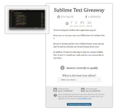
    Here’s what my giveaway looked like:

    I walk through the entire process in detail in this post, but here are the basic steps:

    • Install the plugin on your WordPress site.
    • Choose a background image and shareable product image.
    • Add your Facebook and Twitter accounts.
    • Write a headline and some simple body copy that explains what they’ll get and how the giveaway works.
    • Hook it up to your Aweber or MailChimp account.

    Kingsumo Giveaways isn’t free, but it’s one of the best investments you can make to grow your list. (You can also get a 50% discount for the plugin here.)

    3. Plan Your Promotion

    Even with a good prize, your giveaway won’t work if you just launch and hope for the best.

    You need to give it a good shove to get it started, and then you’ll need to keep promoting it until the clock runs out.

    Here are a few ways you can get the word out:

    Announce your contest on your blog: This one’s a no-brainer.

    Use social media: But don’t just tweet once or throw up a single Facebook post. You should post 1-3 times per day as long as your contest is active. I usually do two tweets—one in the morning and one in the afternoon each day.

    Email your list: Contact your existing list when you launch. This will give you an initial burst of exposure to get the ball rolling. (Especially important if your contest has a viral component.)

    You should also plan to email them again on the last day for a final flurry of signups. (Bonus tip: This is a MUST any time you’re promoting something to your list, whether it’s a giveaway, a webinar or a great deal on your latest ebook.)

    Yes, you’ll get people from your existing list entering the giveaway if you do this. But the extra mileage you get when they share your contest is worth it.

    Use paid advertising: This is a good option if you’re just starting out and have just a handful of existing subscribers. When you buy ads on Facebook or Twitter for a giveaway, you’ll get lots of engagement (cheaper clicks!) and people will even share your ads (free advertising!).

    “Borrow” an audience: Even if you don’t have much of an audience yet, you can try to team up with someone who does.

    Insider List: If you have a group of close friends or colleagues in your space or in your target audience space, give them a heads up a few days before to see if they have any feedback or if they can promote.

    Find a few people who have big email lists—and whose audiences overlap with yours.

    Then figure out something you can offer in exchange for them promoting your contest to their list.

    This could be as simple as trading your services as a web designer. Or maybe they sell a product that you could include in your giveaway, which means more exposure for them.

    4. Run Your Giveaway!

    Schedule everything in advance as much as possible. This is especially helpful for the initial wave of promotions, where you want to hit multiple channels at once for maximum impact.

    • Automate as much of the launch process as you can.
    • Bulk schedule tweets in advance with Plugg.io, usually a minimum of two per day, plus some extras on the last day.
    • Schedule out the launch email and the “last chance” emails.

    I like to run my contests for a MINIMUM of 10 days to two weeks so that I have plenty of time to promote them.

    With the main promotions automated ahead of time, there’s not a lot you have to do to manage the giveaway. Use the time to experiment with other promotional strategies to keep the entries coming in. Two weeks is enough time to contact other sites in your niche, or test out some Twitter or Facebook ads.

    And definitely make one last push as the clock winds down–urgency is a great motivator!

    Fast, Easy and Inexpensive

    Before I started doing giveaways, I was mainly building my list through blogging and Twitter. In a good month, I’d get 200 or 300 new subscribers. It took me more than 8 months of painstaking work to hit the 1K subscribers mark.

    Giveaways are quick and easy to put together. In my case, I spent just an hour or so getting KingSumo set up and installed and another hour planning out my promotion strategy and scheduling the emails and tweets. Once I did that, the entire contest was set to run on autopilot. Well, at least until my server melted down … 🙂

    Giveaways also far less costly than traditional advertising. In my niche, I find that I’m able to get email subscribers from Twitter ads for ~$1.50 each and ~$3 to ~$4 on Facebook.

    By contrast, my per-subscriber cost on my first two giveaways was about $0.15, and for the crazy successful contest I ran with KingSumo, I paid a whopping $0.001 per subscriber.

    I would have burned through $281,986.50 to collect the same number of addresses with Twitter ads.

    That’s why Step 1 (picking the right prize) is so important.

    For each of my contests, the prize only cost me $70! If I’d given away an iPad in my first two contests, I’d have paid closer to $1 each for the subscribers—and they would have been less targeted.

    But the best part about adding giveaways to your list building arsenal is…

    You can run one every few months and every time there is a greater chance that it will go viral.

    Lesson 7 Task

    1) Choose a prize. Remember that the best prize is something that’s desirable to your target audience but uninteresting to everyone else.

    2) Set up your giveaway, either by creating a page on your site with an optin form or installing the KingSumo Giveaways plugin on your WordPress blog.

    3) Pick three channels for promoting your giveaway, including at least one that involves reaching out to an audience beyond your own.

    Leave a comment on Email1K with your plans to get in front of an outside audience.

    4) Launch your giveaway, and promote it heavily for 10 days.

    P.S. If want the full, gory details of my Sublime text giveaway I shared them in a guest post on the Smart Passive Income blog.

    Lesson 6: How To Get 10X More “Warm” Emails With Joint Ventures


    Email1K

    Written by Joseph Michael Nicoletti at Product Creation Live

    Looking for previous lessons? Lesson 0 | Lesson 1 | Lesson 2 | Lesson 3 | Lesson 4| Lesson 5

    What if I told you there was a strategy to getting more email subscribers in 3 days than you collected all year? And what if I told you they would all be highly targeted “warm” email addresses?

    You’d probably say that sounds too good to be true, right?

    That’s what I would have said if you told me that back in 2012.

    My Business – 2 years ago…

    • I was hustling everyday.

    • I was writing 3 posts a week.

    • I had an optin bribe in my sidebar.

    • I was doing everything ‘they said you were supposed to do’.

    I did all of this for a full year and managed to get roughly 700 email subscribers. Not bad I suppose, but not great either. Not life changing that’s for darn sure.

    Fast forward to My Business in 2014

    • Still hustling everyday

    • Built a digital product that solved a specific pain for a specific group of people

    • Partnered with influencers who already had those specific people in their audience

    • Collected more emails in the last 3 days than the previous 12 months.

    • Quadrupled my income

    • Quit my day job

    • Doing what I love every single day

    Now that is life changing!

    So what is the strategy I’m talking about? Joint Ventures. And more specifically Joint Venture Webinars.

    As Jay Abraham says, “Joint ventures are the single fastest way to build your business”

    I don’t know about you but I’ve never been a very patient guy, so when one of the most respected business coaches in the world starts talking about the fastest path to success I pay attention.

    Starting in January of 2014, I completely changed my business model and started to focus on doing joint venture webinars with those who already had the trust and attention of the people I was trying to reach.

    3 Added Benefits To Using This Strategy

    1. Enormous time savings: Think amusement park front of the line pass!

    2. Instant market access: To the exact market you are trying to reach (warm leads).

    3. Recognition and trust: These 2 things take the “hard part” out of selling.

    The Proof

    Doing JV webinars has grown my list from 700 email subscribers (which remember took me over 1 year to collect) to over 12,000 in the past 9 months.

    In the past I’ve tried SEO, Facebook Ads, every opt-in bribe you can imagine and even had a blog post go viral and got over half a million shares, but NOTHING has built my email list (& wallet) faster than doing joint venture
    webinars.

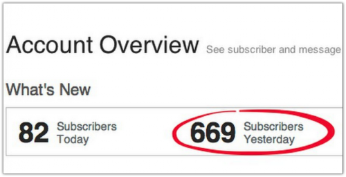
    Take a look at the numbers from just one day of a typical JV webinar promotion:

    Now picture getting 600+ email subscribers every day for 3-4 days in a row…over and over again! Do I have Your Attention now? 🙂

    How I Do It:

    It all starts with the setup. When I approach a key influencer in my market I know they are extremely busy and putting together a webinar promotion takes a lot of time.

    There is also a lot of technical setup. I know these are 2 BIG pain points for many people at this level. Especially the time they fear it will take.

    The number one mistake most people make when trying to book JV partnerships is approaching it from a what’s in it for you mindset instead of a what’s in it for them mindset.

    Remember Neville’s Giving Gary Framework in Lesson 5?

    Typically high level influencers are concerned with 3 things

    1. Value: Added to their audience

    2. Profit: This is what keeps them in business

    3. Time: They don’t have a lot of it and they guard it carefully

    For example when I approach someone with a JV opportunity, I am always keeping these 3 things in mind and making them abundantly clear in my communication with them.

    Here’s is my 5 step process that you can use to hold your own joint ventures and grow your email list.

    Step 1: Identify Who Has Your Audience

    It’s been talked about a lot already but that’s because it’s a great tool: Buzzsumo. (No relation to AppSumo other than the fact that they are both sumo-awesome). Simply do a keyword search and see who has already written about your topic.

    For instance since my training program is for Scrivener, I simply did a search for the term “Scrivener”. Rocket science I know.

    (If you don’t know it, Scrivener is software program designed for writers to help them structure and organize their content. Think Microsoft Word on steroids.)

    Next I’m looking for articles that are relevant and have high number of shares. This usually means whoever wrote the post already has a large and engaged audience. The audience I want!

    Two things I notice right away:

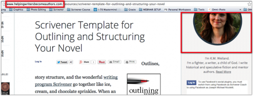
    The site name: HelpingWritersBecomeAuthors.com – PERFECT

    A picture and bio of the author: Great – this usually means the site is run by an individual and not a massive organization. Individuals are usually more invested in their readers and are generally more open to the idea of doing webinars. Plus there are less hoops to jump through when trying to find the point of contact.

    Look for the best ways to get in touch. This could be through Facebook, Twitter, or a contact form on the site. I always click through Twitter first to see if they are active on there.

    Step 2: Start The Conversation

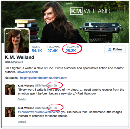
    Bingo! 28.3K followers and tweets in the last 2 and 3 hours. This is a good place to start a conversation and start sharing some of their information. This takes patience. I try to engage, share, and bring value any way I can for at least a week or two before asking for anything.

    Once the timing is write I may throw out something as simple as a “Hey any interest in doing a joint Scrivener Webinar for your audience”. If you’re patient and take your time with this 9 out of 10 times the response will be “Sounds interesting can you email me some details”.

    Here’s a sample email (click to download) that resulted in a $35,000 webinar promotion and over 2,000 emails in 4 days.

    Step 4: The Strategy – A Done-For-You Experience


    (My secret sauce)

    Business whether P2P or B2B is all about the experience. The better the experience the better the results.

    Since I’m good with the tech stuff (and I want the emails) I approach my JV’s with a ‘done-for-you’ package and tell them I can handle everything for them including:

    • Building the registration page (I use LeadPages)
    • Building the thank you page (Again LeadPages)
    • Custom Sales / Promo Page (Leadpages or OptimizePress)
    • Hosting the webinar (I use GoToWebinar)
    • Hosting the Replay Page (LeadPages or OptimizePress)
    • Replay video hosting (I use Vimeo)
    • Email communication (Aweber)
    • I’ll even create graphics that they can share on social media such as this one

    *Note: It helps to have the correct dimensions for the platform. For example, this image is made specifically for Twitter 1024×512 pixels. Look how much of a difference an image makes in a normal Twitter feed such as Tweetdeck.

    Make Them Look Good

    I let them know that even though I am putting everything together they are still captain of the ship and as far as the audience is concerned they will still appear as the host and I will be coming on as their guest. Of course I always give them the option to run everything themselves too, but I have yet to work with anyone who has chosen to do that. They LOVE the fact that they can pretty much sit back and relax while I handle the show. Once agreed I give them a custom webinar outline
    that includes the entire play-by-play. [Click here for the template]

    Step 5: Collecting The Emails

    Since I’m running all the tech and email communication then it’s only natural that I add them to my own email list provider right?

    Here’s my basic workflow for collecting the emails:

    So essentially each registration triggers a new subscriber added to my email list. I also always offer to export the email registrations from GoToWebinar and send them the CSV file if they want to import them into their own email system but I’ve only had 1 person ask me to do this.

    Is this extra work? You betcha!

    Is it a major headache? Yes, Every. Single. Time.

    Is it worth it? Well since you’re signed up for Email1K then you already know the answer to that question.

    Nobody said collecting up to 700 emails in a single day would be easy. But nothing worth having is. If you want something that nobody else has then you have to do what nobody is doing. You have to look for ways that you can fill in the gaps of what nobody else is willing to do.

    Lesson 6 Task

    1) Find 3 Influencers who have your audience (use Buzzsumo.com).

    2) Reach out to all 3 on Twitter (if they are active) and add a valuable comment.

    3) Add a calendar invite 1 week from today to invite them to do a joint venture webinar with you.

    Last write a comment on Email1K on the ideal topic for your Joint Venture Webinar based on your expertise and the influencers you found.

    * * *


    Install SumoMe’s Share tool on your site to get more social shares. Try sharing today’s post using the Share app on the left of this post.

    Lesson 5: I hate Leeching Larry


    Email1K

    Looking for previous lessons? Lesson 0 | Lesson 1 | Lesson 2 | Lesson 3 | Lesson 4

    Read time: 7 minutes
    Life changing value: 8/10
    Comment at the end and win prizes!
    Written by Neville Medhora at Kopywriting Kourse

    Lemme tell you about this douchebag I know named Leeching Larry.

    The first week I met him, he asked to borrow my car.

    The next week he asked me to introduce him to a wealthy friend of mine so he could pitch some stupid business idea.

    The week after that he rented his apartment out, and asked to stay at MY place for 7 days…..for free.

    I’d had enough. I unsubscribed to his friendship. Everytime he contacted me it was asking for something…..and I got nothing in return.

    On the other hand, I have a close friend named Giving Gary.

    When I met him, Giving Gary played wingman for me and I ended up meeting this awesome girl.

    The first time I had dinner with Giving Gary, we had an invigorating 3 hour conversation that gave me SO many new business ideas!

    Giving Gary called me up a week later and invited me to a private gathering of entrepreneurs where I made SO many awesome connections and new friends.

    A few weeks later, Giving Gary asked me if I could help him move. I enthusiastically said “HELL YES”!

    Giving Gary had already given me so much awesome friendship, and so many connections and ideas that I was super willing to help my FRIEND with whatever he needed.

    By the way…..after helping him move, he even treated me to a fancy steak dinner.

    Giving Gary is one helluva guy!

    In the marketing world however, people turn into THAT douchebag Leeching Larry:
    “How do I raise my prices?”
    “How do I double my email list quickly?”
    “How do I increase my website traffic?”
    “How do I get people to pay me more money?”
    “How do I build a big business so I don’t have to work?”

    Geez….no wonder so many people never build a successful business! They’re being selfish assholes and not trying to help others!

    Making money is about giving value to someone else.

    If YOU give someone valuable things, THEY will reward you.

    And the same principle applies to your email list signup forms!

    SO instead let’s flip all these questions around, and ask them like Giving Gary would ask them.

    For example:

    This giving mentality is how a true long term friendship works, and it’s how growing your email list and business works too. People sign up (or buy) from people they like and trust.

    So when it comes down to write a line for your SumoMe email popup, you can easily figure out the best line to write by asking, “How can I HELP people and offer something valuable to them like Giving Gary??”

    Ohhhh, let’s do some examples!!

    Here’s what douchebag Leeching Larry would write. Probably something really selfish and un-inspiring like this:

    Now how can we flip this like Giving Gary? Perhaps by giving away something really helpful to your audience? Maybe something like……

    Now we’re talking! But let’s even further and tell them how valuable this resource is so they totally want it and wouldn’t miss it for the world:

    There….you see how we spiced this up?
    …we told them what they’re getting.
    ……we showed them why it’s so valuable.
    ……..we’re gonna show them how they can use it.

    We can even make our signup forms MORE compelling and add in some of that good ole charm and personality! You’d almost HAVE to signup if you saw this fun offer:

    Today I present you the gift of the Giving Gary Framework.

    Every email you send, every Call To Action you write, every sales page you send people to……can be positively affected by thinking like Giving Gary. People like being helped, so help them!

    Think about it, which of these two dudes are you more likely to subscribe to and buy from??

    LEECHING LARRY: “Buy my product and give me money.”

    -vs-
    GIVING GARY: “This tool will help you get more signups on your page, let me show you how…”

    LEECHING LARRY: “My email list is the best, you should signup.”

    -vs-
    GIVING GARY: “I want to give you a free mini-course about Kopywriting, what email address can I send it to?”

    LEECHING LARRY:“You need to buy this product to make more money…”

    -vs-
    GIVING GARY: “I just found a tool that helps me predict which article will get the most traffic, let me SHOW you how to use it step-by-step….it’s made me so much money these past few months.”

    Starting to see the difference in mentality?

    I could easily give you some cheesy formulas to write headlines and Calls To Action with…but these only work in certain situations, and are hard to repeat every single time. For example, here’s a nice little headline formula I like using sometimes:

    With this specific formula we could concoct a headline like this:

    [Get higher email signups] + [with only 5 minutes of work] + [even if you have low traffic to your website]

    Not bad huh?

    But these kind of formulas are small tactics and gimmicks compared to the Giving Gary framework of thinking.

    And to make sure this Giving Gary mentality is embedded in you, I have some SumoWork for you, and I’ll totally make it worth your while 😉

    (I love how adding a winky face makes that sentence sound so dirty)!

    Lesson 5 Task

    STEP 1) Eat a 7,000 calorie Sumo meal for breakfast.

    STEP 2) Write a Giving Gary type headline that will give people awesome stuff for your List Builder, Scroll Box, or Smart Bar. Write it in the comments .

    BONUS POINTS if you write your previous Leeching Larry Call to Action, and your new Giving Gary call to action.

    STEP 3) I am giving away a free NevBox (worth $97) to three commenters in the comments. I will ship the NevBox to you anywhere in the world for free. So comment now and you might win (See, I’m even pulling a Giving Gary on you RIGHT NOW)!!!

    It’ll be awesome to see all the comments from everyone!

    Sincerely,

    Your Brown Sumo Friend – Neville Medhora

    P.S. I’ll be writing another piece for this Email1K series. Keep an eye out for my brown face in your inbox. It might be slightly offensive, but it’ll teach you well my dear fatass Sumoling 🙂

    P.P.S. Go comment now with your new Giving Gary call to action and you could win a free NevBox delivered to you anywhere in the world!

    * * *


    Set up SumoMe’s List Builder tool on your site to be a Giving Gary. The lightbox popover can be customized to automatically popup after a certain amount of time, or you can use our smart mode to ask your visitors to subscribe when we think they’re getting ready to leave your
    website.